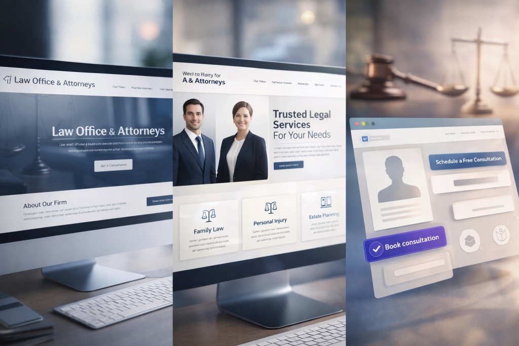
Most attorneys assume that a “Free Consultation → Call Now” button is enough to convert visitors into clients. In reality, today’s legal consumers behave very differently. They compare firms, read reviews, hesitate, and often leave a website without ever contacting the lawyer—even if they need urgent help.
The missing ingredient? Psychologically crafted CTAs (Calls-to-Action) that speak directly to how clients think, what they fear, and what emotional triggers make them take action.
In this deep guide, we break down the proven psychological principles behind high-converting law firm CTAs and show exactly what gets potential clients to call, click, and schedule consultations.
Why CTAs Matter More for Lawyers Than Other Industries
Legal services are not an impulse purchase. Visitors landing on an attorney’s website often feel:
- Anxiety — fear of penalties, jail, or financial loss
- Embarrassment — especially for DUI, domestic violence, or criminal charges
- Urgency — court dates, police contact, MVA deadlines
- Distrust — fear of being overcharged or misled
- Confusion — unclear legal steps and unknown outcomes
Your CTA must ease these emotions and guide the user into taking a confident step toward help. CTA psychology in law is about reducing mental friction, increasing safety, and providing clarity.
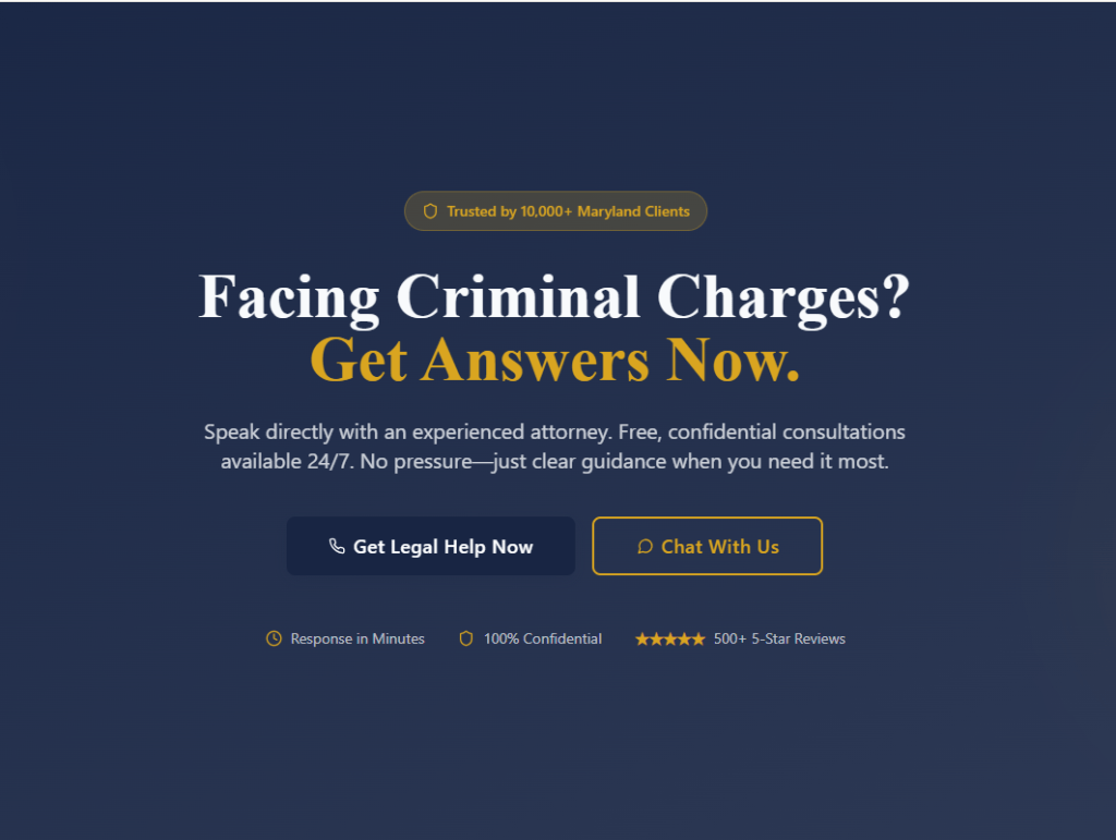
Principle #1 — The “Anxiety Gap”: Clients Take Action When Fear Is Resolved
When someone visits a law firm website, they are already under stress. A good CTA does not push—it removes fear. High-converting CTAs speak directly to the problem and offer immediate relief.
Examples of fear-reducing CTAs:
- Talk to a Lawyer in Minutes
- Get Answers Before Your Court Date
- Find Out Your Options Today
- Get Legal Guidance Now — No Pressure
These CTAs work because they promise certainty in a moment of uncertainty.
Principle #2 — Clarity Beats Creativity Every Time
A confused visitor will not call a lawyer. The CTA must tell the user exactly what will happen next. No surprises, no vague wording.
High-clarity CTAs answer these questions instantly:
- Who will I speak with?
- Is it free?
- Is it confidential?
- How long will it take?
Examples of clarity-based CTA lines:
- Call for a Free, Private Consultation
- Speak Directly to an Attorney Today
- Get Your Case Reviewed in 10 Minutes
Clarity reduces cognitive load and increases trust—two essential psychological triggers for legal clients.
Principle #3 — “Loss Aversion”: Showing What They Might Lose
People take action fastest when they fear losing something. In law, this trigger is extremely powerful because clients may face:
- License suspension
- Fines and surcharges
- MVA consequences
- Jail time
- Criminal record
Loss-aversion CTAs that convert:
- Avoid License Suspension — Call Now
- Don’t Face Court Alone — Get Help Today
- Protect Your Record Before It’s Too Late
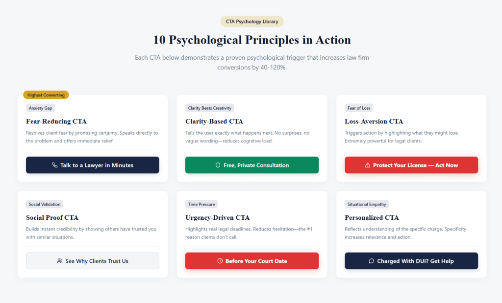
Principle #4 — Social Proof: People Act When They See Others Have Done It
Clients want reassurance that you have successfully helped others with similar situations. CTAs combined with social proof dramatically increase conversions.
High-performing social-proof CTA styles:
- Trusted by Thousands of Maryland Clients
- See Why Clients Recommend Us — Call Now
- Read Our Case Results, Then Contact Us
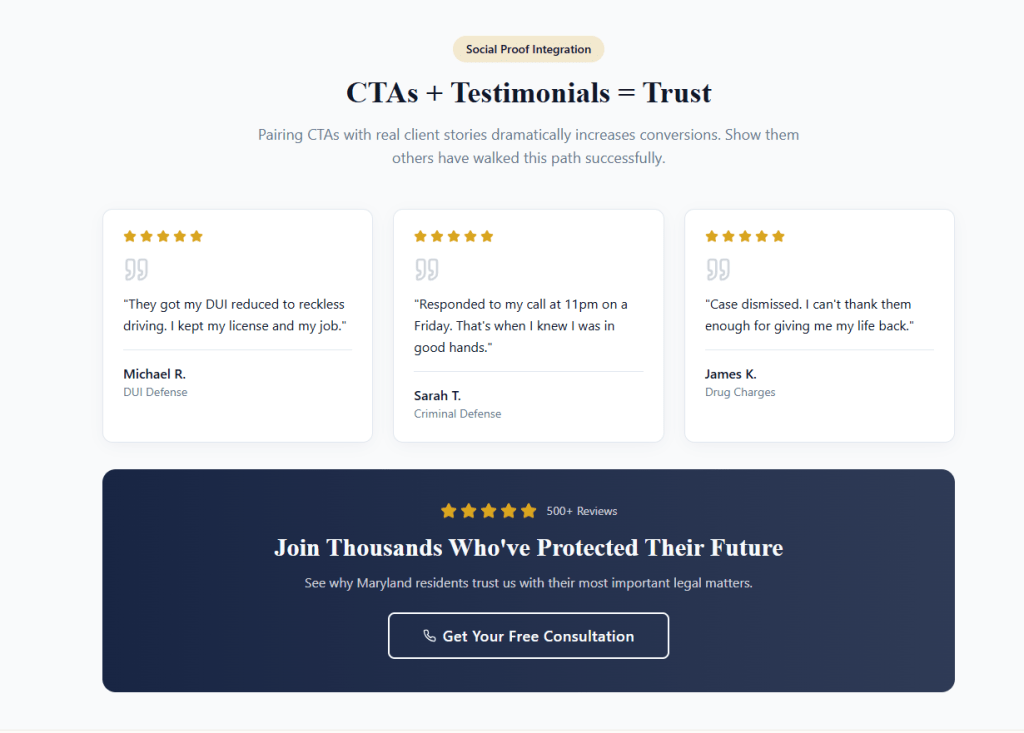
Pairing CTAs with testimonials, reviews, or case outcomes builds instant credibility.
Principle #5 — The “Two-Step” CTA: A Psychological Shortcut That Works
A direct CTA like “Call Now” can feel too overwhelming for high-stress legal clients. The two-step CTA lowers the emotional barrier.
Example:
- Step 1: “Check Your Case Options”
- Step 2: “Call for a Free Consultation”
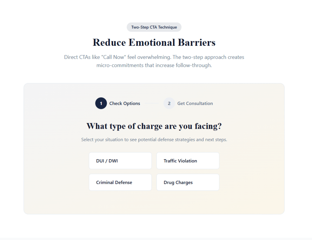
When a user clicks the first button, they mentally commit to the process. That small commitment increases the likelihood they’ll follow through on step two.
Principle #6 — The Right CTA Placement (Above the Fold Is Non-Negotiable)
Where the CTA appears is as important as the wording. For law firms, visitors must see a clear pathway to action without scrolling.
High-converting placement zones:
- Header top-right — phone number with a “Call Now” button
- Hero section — main CTA + secondary CTA
- Sticky mobile bar — “Call Now / Text Us”
- Bottom of each service section
- End of blog posts
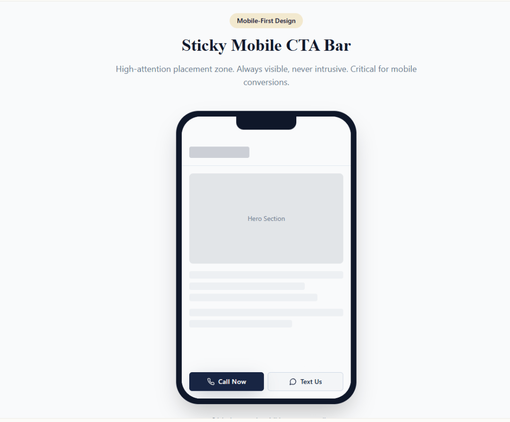
These placements correspond to high-attention areas verified by user heatmaps across legal websites.
Principle #7 — “Micro-CTAs”: Small Hooks That Lead to the Main Conversion
Not every visitor is ready to call immediately. Micro-CTAs build trust and encourage soft conversions that later lead to calls.
Examples of micro-CTAs for law firms:
- Check Penalties for Your Offense
- See If You Qualify for a Reduced Charge
- Read Client Success Stories
- See What to Expect at Court
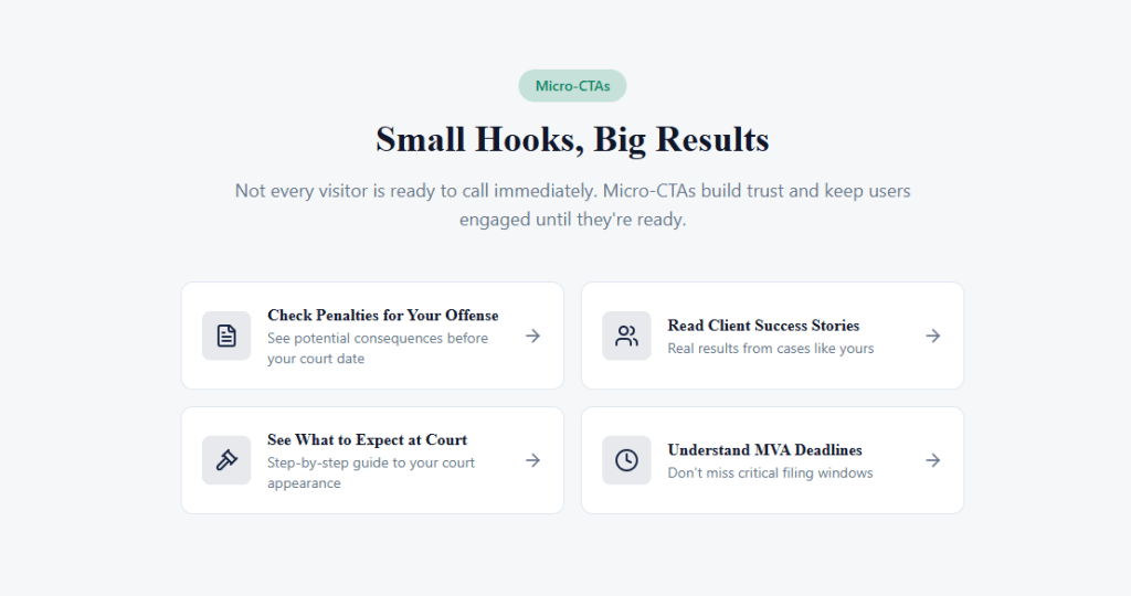
These CTAs keep users engaged and build confidence until they’re ready to contact the firm.
Principle #8 — Personalization: CTAs That Mention the Client’s Situation Convert Better
Generic CTAs feel cold. Personalized CTAs reflect empathy and understanding.
Examples:
- Charged With DUI? Get Help Now
- Traffic Ticket in Maryland? Talk to a Lawyer Today
- Facing Criminal Charges? Protect Your Rights Immediately
Specificity increases relevance, which increases action.
Principle #9 — Urgency: Time Pressure Drives Calls
Legal deadlines are real. When your CTA highlights urgency, clients are far more likely to contact you.
Urgency-driven CTAs:
- Act Before Your Court Date
- MVA Deadline Approaching — Call Today
- Your License May Be at Risk — Get Help Now
Urgency reduces hesitation, which is the #1 reason clients don’t call.
Principle #10 — Visual Design: Colors, Shapes & Contrast That Trigger Calls
Psychology isn’t only about words—visual CTA design impacts user behavior.
What works best for law firms:
- Solid contrasting button color (blue, red, or green depending on brand)
- Rounded corners — more inviting, less aggressive
- Large tap-targe size on mobile
- Short text (2–4 words is ideal)
- Icons (phone, message, calendar) increase clicks
Design isn’t decoration—it directly impacts user motivation.
Putting It All Together: High-Converting CTA Examples for Law Firms
Here are CTA examples incorporating multiple psychological principles:
- Get Legal Help Now — Free, Confidential Consultation
- Talk to a Lawyer in Minutes
- Protect Your License — Call Today
- See Your Options Before Court
- Speak Directly to an Attorney — No Pressure
Each example resolves fear, offers clarity, and reduces the emotional hesitation a client feels.
Final Thoughts: The CTA Is Your Most Powerful Conversion Element
A CTA is not a button. It is a psychological decision point—a moment where a scared, stressed, or uncertain visitor finally feels safe enough to reach out.
When crafted correctly, CTAs can increase your law firm’s conversions by 40–120% without changing anything else on the website.
At Legal Authority Online, we help attorneys implement high-converting CTA frameworks, optimized intake funnels, and persuasive landing pages that generate more calls and consultations.
Want help improving your law firm’s conversions?